A look into the vibrant landscape of inclusive design

Today we’re embarking on a fascinating exploration of the intricate maze that is design, guided by the languages of colour, accessibility, diversity, fairness, and inclusivity.  

Join us on this enlightening journey into the realm of inclusive design. Together, let’s explore how design can embrace diversity, foster accessibility, and champion inclusivity. We invite you to be part of creating a more equitable and harmonious design landscape that celebrates the uniqueness of every individual. Come along and let’s make a difference together in the world of inclusive design. 

Before we jump in, let’s take a moment to reflect on some eye-opening and, at times, sobering facts: 

  • Approximately 1 in 12 men and 1 in 200 women experience colour blindness. Just imagine the daily challenges they face, and it encourages us to consider their needs. 
  • Over 1 billion people worldwide have some form of visual impairment. That’s roughly one-seventh of the global population, reminding us of the importance of designing with accessibility in mind. 
  • Only a mere 3% of stock images feature people of colour, which falls short of reflecting our diverse global community. 
  • On a positive note, a reassuring 70% of consumers prefer to engage with companies that champion diversity and inclusion. 
  • There seems to be a clear discrepancy here, doesn’t there? Perhaps it presents an opportunity for us, as designers, to step up and make a difference. 

Inclusive design: a kaleidoscopic vision for everyone 

Inclusive design breaks free from rigid rules and norms. It’s about crafting products, services, and environments that are accessible to all, regardless of their abilities. It’s about designing a world that bursts with vibrant hues, a world that doesn’t fade into monochrome for those who are visually impaired or colourblind. But inclusive design goes beyond the visual spectrum. It’s about creating a welcoming and inclusive universe that embraces everyone, irrespective of age, size, or ability. It’s about shaping a world where everyone feels valued and included. 

Stocking up on diversity 

Stock images are to the internet what David Attenborough is to nature documentaries – they’re everywhere. Yet, only 3% feature people of colour. As designers, we must strive to choose images that mirror the real world, in all its diversity. Yes, it requires a bit more hunting, but the result is authentic representation and a richer tapestry of human connection. 

Mind the (colour) gap 

Here’s where we really don our superhero capes: in our mission to bridge the gap between what’s available and what’s needed. We believe in adding colour to the world, but in a way that’s inclusive. This is where colour accessibility comes into play, ensuring our designs are friendly to those with colour blindness and visual impairments. 

The tricks of our trade 

In our toolbox, we’ve got a few tricks up our sleeves. We use high-contrast colours and text alternatives for images. We avoid using colour alone to convey information, understanding that for some, colours may not be distinguishable. And above all, we keep the doors wide open to feedback from the disability community, because who better to guide us on their needs? 

Inclusive design is not just about the practicalities; it’s also about our mindset. We need to check our biases at the door and embrace continuous learning because the field of inclusive design is ever-evolving. We should always be mindful of our choices, use inclusive language, and actively involve ourselves in the inclusive design community. By doing so, we can contribute to a more inclusive and accessible world for all. 

Inclusive design in practice 

Take a look around, and you’ll spot glimmers of inclusive design in action. Apple’s VoiceOver feature is like music to the ears of those who are blind or visually impaired. Twitter’s accessibility features give everyone a fair shot at making their tweet go viral. And Google’s Material Design guidelines are like the golden rules of inclusive design. 

Our world is a vibrant tapestry of diverse experiences and abilities. And as designers, our mission is to reflect this diversity in our creations. It’s time to challenge the norms and go beyond traditional design practices that cater only to the “average” user. 

Every decision we make as designers matters – from the colours we choose to the fonts we use and the images we select. It’s in our hands to create a world where design is inclusive, where it doesn’t leave anyone out but celebrates everyone’s uniqueness. 

Inclusive design is not just a passing trend; it’s a necessity, a human right, and an opportunity for businesses. It requires us to be creative, take some risks, and show empathy. It might not always be an easy journey, but as designers, it’s our role to pave the way for a world that values, accepts, and celebrates every individual. 


Be smart, be inclusive with your marketing. Contact us today to help you build an accessible brand. 

How To Design An Accessible Website

Imagine the ever-expanding online universe, a kaleidoscope of possibilities—from shopping to managing finances, it’s all just a click away. But wait! Not everyone can effortlessly glide through websites, especially those with unique needs. 

Now, let’s tackle the ultimate question: How can you ensure that everyone enjoys a seamless website journey? Get ready to ride the wave of accessibility as we unveil actionable steps to boost your website’s inclusivity. By embracing the magic of inclusive web design, you’ll create an experience that not only wows users but also expands your audience. 

Let’s break free from the ordinary and embark on a quest for accessibility! At Be Smart, we’re here to sprinkle our creative flair using inclusive web design, and make your website an inclusive digital wonderland.  

Let your colours shine 

Ah, the mesmerising world of colours, where your website’s palette dances in harmony with your brand. But hold your horses, for there’s more to it than meets the eye—accessibility is the name of the game! 

When choosing your brand’s colours, consider the needs of all users, including those with visual impairments. Aim for ample contrast between text and background colours, ensuring a clear distinction for improved readability. Neon colours? Let’s leave those in the ’80s disco parties—opt for hues that won’t strain the eyes. 

Ah, text, the faithful messenger of information! Choose fonts wisely, my friend. While fancy fonts may be tempting, they can turn into roadblocks for some readers. Opt for legibility and clarity, making it a breeze for everyone to follow along. And remember, size matters! Avoid minuscule fonts that require a magnifying glass—make them comfortably readable, and bold your important information to make it pop! 

Let your colours and fonts weave a tale of accessibility and visual splendour. Together, we’ll create a digital realm where readability reigns supreme. Get ready to captivate your audience with a visually stunning and inclusive website experience1

Navigating the waters of website design 

Ah, the art of website navigation—a fundamental principle of design 101. But wait, there’s more! When it comes to accessibility, intuitive navigation takes centre stage.  

Let’s start with the basics: organise your content with a logical flow. Think of it as creating a treasure map, guiding users effortlessly through your website’s riches. Clear and concise navigation menus become your compass, leading the way with ease. Oh, and don’t forget the power of descriptive labels for links and buttons—they’re the signposts that help users understand their purpose. 

Now, we’re all about making waves in accessibility, so let’s dive deeper. Keep your navigation menus in plain sight, avoiding any hidden treasure chests. Users should be able to locate them with a quick scan, no pirate’s map required.

With intuitive navigation as your anchor, your website becomes a haven of user-friendly exploration. So, hoist the sails and embark on a voyage of accessibility—where smooth seas and clear directions await your users!  

Adapt and conquer: The power of responsive design  

Imagine a website that effortlessly adapts to any screen, from the tiniest smartphone to the grandest desktop. That’s the beauty of responsive design! By embracing this magical approach, you ensure that users with different devices, including those who rely on assistive technologies like screen readers, can navigate your site with ease. 

Gone are the days of squinting at a minuscule screen or zooming in and out like a mad explorer. With responsive design, your website becomes a master of adaptation, providing the perfect browsing experience for every user. 

So, let’s embark on a quest for accessibility that spans across devices and empowers all users. Embrace responsive design, and watch your website conquer the digital landscape with ease. Get ready to leave no user behind on this epic journey of inclusivity. 

ALT tags – a clear vision for accessibility  

Images are visual storytellers that showcase your products and services and entice potential clients. But hold on, there’s more to the picture. For users with visual impairments, images can pose a challenge to accessibility. 

Fear not, for we hold the key to inclusivity: ALT tags. These small but mighty tags provide a helping hand to those with visual disabilities. By including descriptive alternative text, you paint a vivid picture with words, allowing users to grasp the essence of the image. Accuracy is key—your ALT tags should clearly convey the essential information or context of the image. 

Blurry images, erratic movements, and fading effects may look flashy, but they can pose viewing difficulties. Aim for clarity and stability, ensuring that all users can enjoy a seamless visual experience.  

Unlocking the power of captions and transcripts  

Lights, camera, accessibility! In the captivating world of multimedia, it’s crucial to ensure that every user can fully engage with your content. That’s where captions and transcripts come into play.  

Picture this: videos and audio content taking centre stage on your website. To ensure accessibility for all users, it’s essential to provide captions or transcripts. Captions act as a helping hand for individuals with hearing impairments, allowing them to understand the audio content. Transcripts, on the other hand, offer an alternative format for accessing information. 

By including captions, you’re bridging the gap, enabling individuals with hearing impairments to fully immerse themselves in your multimedia creations. And transcripts? They provide an accessible pathway for users who may prefer reading or need an alternative format to engage with the content. 

So, let’s roll out the red carpet of accessibility. Ensure that your multimedia offerings shine bright with captions and transcripts, and watch as your content becomes accessible to a wider audience.  

Breaking it down – the power of descriptive headings 

Heading tags are the unsung heroes that give your website content a clear and organised framework to help readers navigate through the content. But hold on, there’s more to it than meets the eye… 

Screen readers rely on headings to navigate through the content, so it’s crucial to make them descriptive and informative. Each heading should accurately summarise the section’s content, serving as a guiding light for all users. 

Say goodbye to intimidating blocks of text. Leave those lengthy essays in the schoolyard and embrace the art of breaking up your content. Take a look at what we’ve done in this blog, for instance. Each title offers a glimpse into what lies ahead, preparing you for the captivating journey that awaits. 

Structure your content with purpose and clarity, and watch as your website becomes an inviting space for all. Get ready to embark on an adventure of accessibility, one heading at a time.  

Keyboard heroes – unlocking accessibility for all  

In the world of website navigation, not everyone can rely on a trusty mouse or touch screen. That’s where keyboard accessibility comes into play. Let’s ensure every user can roam your website with ease. 

Imagine a user who relies solely on a keyboard or assistive devices to navigate your site. By making interactive elements like buttons, links, and forms accessible via the keyboard, you open the doors of accessibility. Every user deserves an equal opportunity to explore and engage. 

Oh, and let’s not forget the importance of clear focus indicators. These little visual cues help keyboard users understand their current position on the page, like a guiding star on their digital voyage. 

So, let’s champion keyboard accessibility and empower all users to become digital heroes. If you choose to work with Be Smart, we’ll create a website where everyone can navigate with ease and experience the joy of inclusion. 

Accessibility – a journey of continual improvement  

In the ever-evolving world of accessibility, staying ahead of the game is key. Making your website accessible is not a one-time job—it’s a commitment to constant improvement. 

In this dynamic digital landscape, new methods and techniques for accessibility emerge regularly. By testing for accessibility frequently, you ensure that your website keeps up with the latest trends and sheds outdated practices. It’s all about staying in the loop and embracing the ever-changing nature of inclusivity. 

Here’s a valuable tip: involve individuals with disabilities in usability tests. By seeking their feedback and insights, you gain a deeper understanding of areas that may need improvement. It’s like having accessibility experts right by your side, guiding you on the path of improvement. 

Through regular testing, feedback, and proactive enhancements, your website will become a shining example of inclusivity. Get ready to unleash the full potential of accessibility and create a truly inclusive online experience.  


Website not quite as accessible as you’d like it to be? Contact us today and find out how we can help you to ensure your website inclusivity is spot on! 

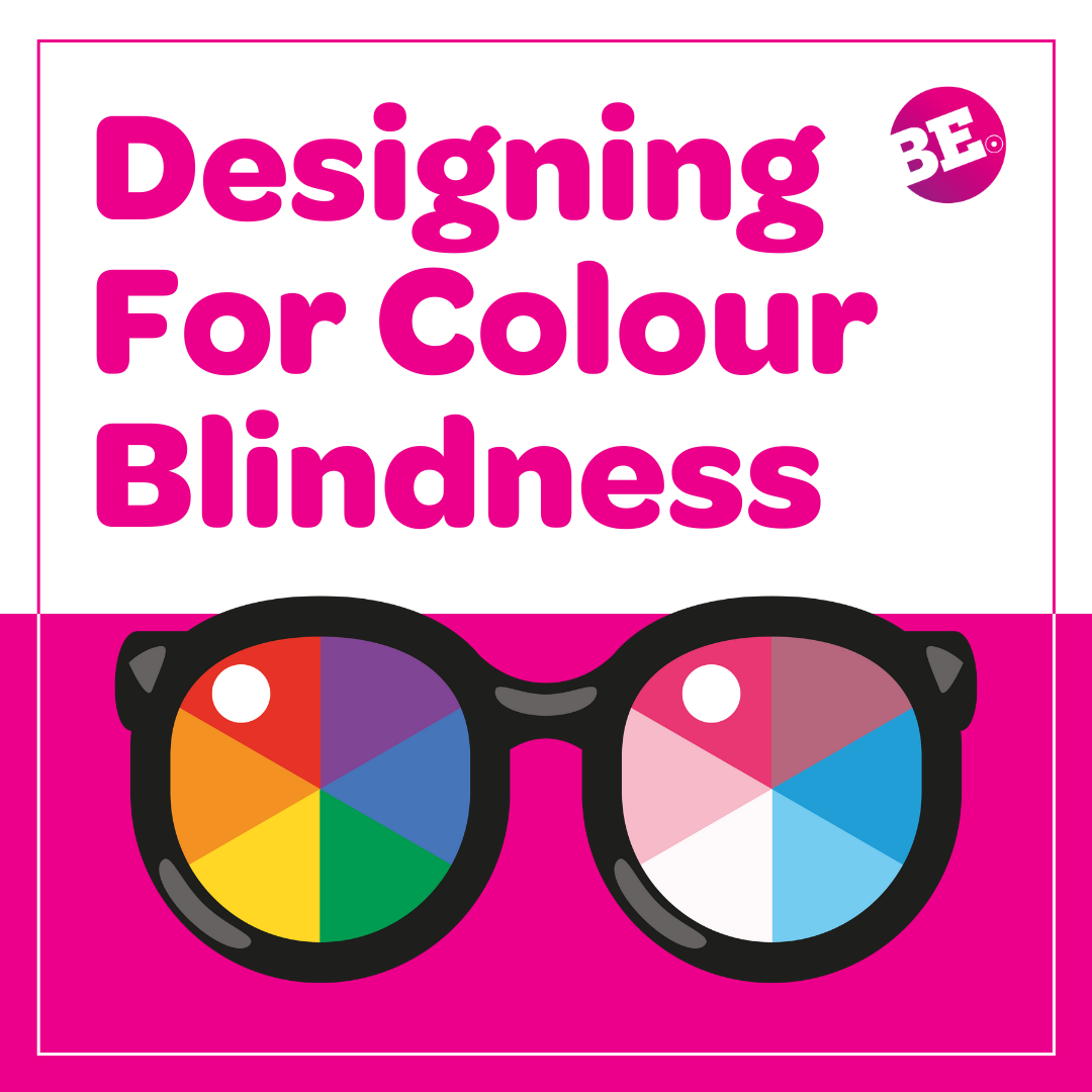
Designing For Colour Blindness

When it comes to design, colour is a powerful tool in your digital toolbox. It allows us to evoke emotions and establish brand identities. Just pause for a second and think about a brand you love – we’re willing to put money on its brand colours being one of the first things to pop into your head! That’s the power of colour. 
However, not everyone can view colour in the same way, and this brings up a whole host of accessibility challenges. Approximately 8% of men and 0.5% of women worldwide experience some form of colour blindness. That’s around 300 million people with colour blindness; to give you an idea of scale, that’s almost the same number of people as the entire population of the USA! 

Designing with colour blindness in mind not only ensures inclusivity but also ensures everyone has the best user experience possible…and you can wow more people with your creative vision. Win, win, right?!  

So, how can we make sure everyone gets to enjoy and access your designs? We’ve got all the tips and tricks you need right here, so without further ado, let’s get started!  

Let’s talk contrast 

So, this is going to be a bit of an obvious one, but the obvious stuff we can easily forget in this increasingly techy world of ours, so consider this your refresher! When designing with colour blindness is mind, one of the key things to consider is, are the colours contrasting enough?  

Colours that contrast sufficiently enhance their visibility and legibility for users with colour blindness. It’s recommended to use a combination of light and dark colours, such as black text on a white background or vice versa. This contrast ensures everyone can easily view your designs and your designs can become part of the inclusive wonderland we’re all striving for – nice!  

Avoid relying solely on colour 

Wait, we’re moving away from colour on a blog about colour? Just hear us out, we promise it’s related! While colour can be a powerful visual element, relying solely on colour to convey information can create those pesky challenges for colour-blind individuals.  

To overcome this, incorporate additional visual cues like icons, patterns, or labels to provide clarity. For example, if you’re using colour to indicate different states of a button (e.g., active, inactive, or error), consider adding corresponding icons or labels to differentiate between them.  

Handle those colour combinations carefully 

There are a few things you need to know when choosing which colours to use as some are more problematic than others. Colour combinations, such as red and green (sorry Gucci, you’re out!), can be particularly challenging for individuals with red-green colour blindness. This is the most common form of colour vision deficiency, affecting around 1 in 12 men and 1 in 200 women. 

It’s best to avoid these combinations and instead, opt for colour palettes that offer sufficient contrast. If you’re struggling to know if you’ve made the right choice with your colours, online colour contrast checkers can help you determine if your chosen colours meet accessibility standards. These nifty tools can be really useful so don’t be afraid to use them to help inform your designs! 

Size does matter  

Size *really* does matter when it comes to font size! In addition to colour choice, ensuring you use an appropriate font size is really important. You can pick the most contrasting colours in the world but if you’re using an itty bitty text how is anyone supposed to read it, let alone those with visual impairments? Whack up that font size and make sure it is accessible to all. 

Psst, bonus tip – pick a font that’s easy to read too! The handwriting ones with the swoopy S’s and dramatic T’s may make you feel like you’re having a Bridgerton moment, but they can be a nightmare to read. Stick to the easy-to-read classics and save the fonts with extra razzle dazzle for your personal life. 

Use icons and symbols to maximum effect 

We’re not drifting away from colour again, we promise! Icons and symbols can be excellent for aiding users in understanding functionality or just providing helpful visual cues.  

When designing with colour blindness in mind, ensure that the icons rely on shape and form, rather than colour alone, to convey their meaning. This allows colour-blind users to understand and interact with the interface effectively. 

For example, we understand red typically means no and green we usually understand to mean yes. Don’t just stick a red and green (we talked about this earlier!) button on your design and call it a day as this can present major challenges for those living with colour-blindness.  

Instead, use icons that we typically understand to mean a certain thing – crosses for no, thumbs up for yes, speaker icons for…well volume adjustment. You get the idea!  

Time to call in the experts

It’s pointless to sit there and try to guess whether your designs are accessible for those living with colour blindness. Ensuring you conduct user testing with colour-blind individuals is really just common sense as they can offer firsthand insights and feedback that can provide invaluable guidance. 

Observing how users with colour blindness navigate your design and listening to their experiences can help you identify areas that need improvement and make necessary adjustments. Plus, you save time on all the guess work, freeing you up to work on other projects. 

Embrace accessibility tools 

Embracing accessibility tools, such as colour-blind-friendly modes or customisable options, is a significant step towards creating an inclusive environment. Incorporate colour-blind friendly modes into user interfaces and customisable options like font size, contrast settings and those nifty keyboard shortcuts. This allows users to personalise their experience based on their unique needs and you to reach a wider audience. 

By embracing these tools, we can foster a more inclusive digital landscape that values diversity and ensures that everyone can fully participate and engage with technology. Sounds pretty wonderful if you ask us! 


Want to ensure your website and/or branding are accessible for all? Contact us today, we’d love to help you make sure your designs are top notch and ready to be appreciated by all! 

Why we chose the colour magenta for our brand identity

Join us as we embark on a captivating colourful journey through the enchanting universe of magenta, the mesmerising hue that has stolen the hearts of all of us here at Be Smart 

Magenta’s vibrant, bold, and awe-inspiring charisma is the very reason we chose it as the  core of our brand identity, eliciting admiration from both our clients and team members alike. 

 So, why did we fall head over heels for magenta? Join us as we embark on a chromatic rollercoaster of inspiration, wonder, and enlightenment. 

The magenta backstory 

To fully appreciate the captivating allure of magenta, let’s take a nostalgic journey. The name “magenta” made its debut in 1859, paying tribute to the Battle of Magenta in Italy. This audacious shade swiftly rose to prominence as a revolutionary aniline dye known as “fuchsine” which mesmerised the world. Over the years, magenta solidified its position in the colour palette, becoming timeless in the realms of fashion, art, and design. 

Magenta’s natural beauty 

Take a moment to appreciate the natural wonders that showcase the splendour of magenta. From the striking petals of fuchsias and orchids to the mesmerising feathers of flamingos and hummingbirds, magenta reigns as the undisputed queen of colours, captivating all who witness its brilliance. Here at Be Smart, we proudly embrace magenta as our signature shade. Its vibrant presence adds a pop on social media and branding efforts, while infusing our work with a touch of magic and undeniable joy. 

The magenta chakra connection 

But that’s not all! Magenta is more than just a visually appealing colour. It has a deep connection to the crown chakra, which is the seventh and final major chakra located at the top of the head. The crown chakra plays a vital role in guiding clear thinking, a sense of purpose, and a profound connection to the divine. Interestingly, the crown chakra is also associated with creativity, intuition, spirituality, and enlightenment – qualities that we strive to infuse into our boutique branding, design and digital agency. The affinity between magenta and the crown chakra is no coincidence; it adds an extra layer of significance to our work. 

The mystery of magenta 

Perhaps the most fascinating aspect of magenta is its very existence – or lack thereof. You see, magenta doesn’t genuinely exist on the visible colour spectrum. Instead, our brains invent this alluring hue to fill a void, essentially telling us that the colour we’re seeing “isn’t green.” A blend of red and violet, magenta defies the colour spectrum laws, which dictate that green should be the colour we perceive. Instead, our minds generate magenta, a captivating phantom that exists solely in our imagination. 

Magenta also holds a captivating duality. It straddles the line between warmth and coolness, effortlessly blending the fiery ardour of red with the serene composure of blue. This perfect balance makes magenta a versatile and adaptable colour, capable of conveying both playfulness and sophistication, depending on how it’s used. Its ability to evoke different emotions and moods allows magenta to be a flexible choice that suits various contexts and purposes. 

Why Be Smart chose magenta 

With its lively presence, spiritual meaning, and enigmatic origin, magenta personifies the playful, provocative, and confident essence of Be Smart. By adopting this fabulous colour, we’ve distinguished ourselves from the competition and embraced the risk-taking, assertive, and light-hearted spirit that characterises our small boutique branding and design agency. 

In a nutshell, magenta is the ideal colour to represent Be Smart. It’s bold, eye-catching, and deeply connected to creativity and intuition, while its mysterious nature adds a dash of humour and irreverence to our brand. Magenta encapsulates the soul of our agency, and we’re over the moon to share its magic with the world. 

So, the next time you spot magenta, remember that it’s more than just a colour; it’s a symbol of the infinite creativity, imagination, and inspiration within each of us. And who knows? Perhaps magenta’s unique charm will inspire you to take a leap, unleash your inner artist, and be smart, just like us. 

Are you ready to infuse your brand with colours and designs that will breathe life into your creative visions? 


Get in touch with our talented team at Be Smart today, and let’s embark on a journey to craft your brand identity! 

Pink is back! The Influence of Pink in Brand and Design

Well tickle us pink (yeah, we know), because today we’re talking about one of our favourite colours that’s taken the throne once again – pink! It’s bold, it’s vibrant, and it’s unapologetically back in the spotlight.  

So, let’s take a closer look at why this powerhouse hue is back in fashion and how it’s shaking up the design and branding world. 

The power and meaning of pink 

Pink has always been a colour loaded with meaning. Traditionally, it’s been associated with femininity, sweetness, and romance. However, modern interpretations have pushed these boundaries, giving pink a more exciting and versatile role. It’s a colour that can be both playful and sophisticated, soft and powerful.  

In branding, pink is used to convey a range of messages and emotions too. It can be warm and inviting or daring and rebellious. The key is in the shade and context! For example, soft pinks might suggest care and nurturing, ideal for wellness or beauty brands. On the other hand, bright, hot pinks scream energy and fun, perfect for products aimed at a younger, more typically adventurous audience. 

Barbie’s big influence 

Let’s talk about the elephant—or rather, the doll—in the room. Barbie. Yes, that Barbie. The Barbie movie (we love you, Margot Robbie!) has not only reintroduced us to this timeless toy but also reignited our love for all things pink. Barbie’s world is a pink paradise (when can we move in?), and this aesthetic has spilled over into the fashion and design realms in a big way. It seems that “think pink” is the new motto for brands. 

The film’s marketing was a masterclass in branding too. Every poster, product tie-in, and social media post was awash with vibrant shades of pink, creating an unmistakable and clear identity. This rebranding of Barbie has shown that pink is not just another colour; it’s a statement. It’s all about embracing a bold, unapologetic style and rejecting the notion that pink is “too girly” or “not serious”. 

Brands have picked up on this cultural shift too. Suddenly we’re seeing a lot more pink in the palettes. The impact is clear: pink is no longer seen as frivolous or niche. It’s powerful, versatile, and here to stay – and we are thrilled about it! 

Pink’s past prejudices 

Sadly, pink hasn’t always had it easy. For a long time, it was pigeonholed into a corner—deemed too feminine, too frivolous, or simply not professional enough. Fortunately, those days now appear to be a thing of the past. The rise of gender-neutral fashion and the breaking down of colour stereotypes have paved the way for pink to be appreciated for what it truly is: a versatile and exciting colour that can transform brands and captivate audiences. 

Take a moment to really think about it. Why shouldn’t pink be used in serious contexts? Why can’t it be the face of a powerful brand? The past few years have seen a cultural shift towards inclusivity and breaking norms. Pink is riding this wave, moving beyond its outdated prejudices and becoming a colour that represents strength, innovation, and inclusivity. 

Brands that nail their pink branding 

T-Mobile 

T-Mobile’s magenta is iconic. In an industry that has a whole lot of blue, black and grey, choosing such a standout colour was a smart move. This telecom giant has taken pink—a colour traditionally seen as soft—and made it synonymous with speed, reliability, and innovation. Their branding is a masterclass in consistency. From their stores to their promotional materials, the bold pink stands out, making them easily recognisable and reinforcing their brand identity.   

Victoria’s Secret 

When you think of pink in branding, Victoria’s Secret probably springs to mind. The brand has expertly used pink to define its identity, especially through its sub-brand PINK. Targeting a younger demographic, PINK uses a vibrant palette to create an image that’s both youthful and sophisticated. This clever use of colour has helped Victoria’s Secret remain a dominant force in the lingerie market, appealing to women of ages with a mix of fun and glamour. 

Glossier 

Glossier, the beauty brand that’s taken the world by storm, uses pink to communicate simplicity, elegance, and modernity. Their soft, millennial pink packaging is instantly recognisable and has become a symbol of their minimalist, user-friendly approach to beauty. Glossier’s branding proves that pink can be chic and sophisticated, appealing to a broad audience with its fresh and contemporary vibe. 

Pink in pop culture: Legally Blonde 2, Mean Girls, and the new Barbie 

Pink’s influence extends far beyond branding and into the realm of pop culture. Let’s rewind a bit and revisit some iconic moments where pink stole the show. 

Legally Blonde  

As if we could talk about pink in pop culture without mentioning Legally Blonde! Elle Woods, with her bubbly personality and pink outfits, taught us that pink can be powerful and professional. In “Legally Blonde” Elle’s pink wardrobe is more than a fashion statement; she redefines what it means to be a professional woman in pink, making it clear that competence and colour can go hand in hand. 

Mean Girls 

“On Wednesdays, we wear pink.” This line from “Mean Girls” became a cultural phenomenon, cementing pink as a symbol of popularity and power in high school hierarchies. The film used pink to represent both the exclusivity and the camaraderie of the Plastics, showing how colour can be a critical part of group identity and social dynamics. 

The New Barbie 

As mentioned earlier, the new Barbie movie has redefined pink for a new generation. The film’s visual feast of pink shades, from bubblegum to fuchsia, has captured the imaginations of audiences worldwide. It’s a reminder that pink can be playful, nostalgic, and forward-thinking all at once. The movie’s success has inspired brands to embrace pink in their marketing strategies, proving its enduring appeal and versatility. 

Final thoughts 

It’s pretty obvious at BeSmart that we love ourselves a bit of pink; our branding is magenta after all. Our use of magenta isn’t just about aesthetics though, we also use it to show what our brand is all about. This includes, uniqueness, creativity, friendliness, and even spirituality through magenta’s link to the crown chakra. This symbolises higher thinking, reflecting our approach to meaningful design. We always knew pink was powerful! 


Get in touch today to discuss your brand colours and how we can help you to create branding that really resonates with *your* audience!  

Proudly Authentic: Brands That Avoid Rainbow Hype And Show Genuine Pride

Pride Month is here, and with it we’re going to see a whole slew of rainbow branding and products. Now don’t get us wrong, we love to see the colours of the rainbow flying loud and proud! However, Pride month brings with it a whole lotta “rainbow washing”, with companies focusing on profits rather than authentic support.  

So, what is rainbow washing all about and how can you make sure your brand isn’t caught red (rainbow?) handed jumping on the LGBTQ+ bandwagon with ill thought-out campaigns? We reveal everything you need to know and even take a peek at some brands who have nailed authentic LGBTQ+ support!  

Okay, but seriously, what is rainbow washing? 

You know the story; It’s Pride Month, and every shop window you pass (in-person or whilst roaming the internet!) is adorned with rainbow-themed merchandise. Brands and companies are releasing limited-edition rainbow products, each claiming to be “supportive” of the LGBTQ+ community. On the surface, it seems like a glorious display of inclusivity and allyship. But beware! This phenomenon is what we call “rainbow washing”. 

Rainbow washing happens when companies and individuals use rainbow symbols and slogans to portray themselves as LGBTQ+ allies, yet their actions and policies tell a different story. At its core, it’s a performative display of support with a sneaky focus on using it for profits. This happens to a lot of awareness holidays, including Black Lives Matter, Black History Month, and Earth Day. 

So, how do I show support for the LGBTQ+ community the right way? 

Sure, rainbows are fantastic, but genuine support requires more than just whacking some colourful symbolism on your products and calling it a day. It’s lazy, unauthentic and can actually do harm to your company in the long run, particularly with Gen Z shoppers on the rise. This generation is more tech savvy and connected than any generation before it, and something they value above a TikTok dance, or a viral meme is honesty and unfiltered realness. 

You’ve told us the wrong way we hear you cry, so what the heck is the right way to show support? To get started on the path to true inclusivity, you need to think about the below: 

Educate yourself 

This one is really obvious, but it is often skipped. Before expressing support, take the time to educate yourself about the issues faced by the LGBTQ+ community. Learn about their history, the challenges they continue to face, and the progress they’ve made. Understanding their struggles and victories will give your support a more profound meaning and ensure you don’t wildly miss the mark with something that is instead pretty offensive… we’re looking at you, M&S sandwich 

Look beyond the rainbows 

Yep, the rainbows are great, but genuine support requires more than just colourful symbolism. Do you have inclusive policies for employees? Can you employ a member of the LGBTQ+ community to lead your campaign? Can you work with LGBTQ+ run companies or LGBTQ+ influencers? Will you be supporting or making donations to LGBTQ+ charities and organisations? Don’t try to blind your customers with rainbows, they will dig deeper, and your support will be seen as pure tokenism if its outed as having very little substance. 

Amplify LGBTQ+ voices 

We get it okay, not every business is in a position to make a donation. However, you can still amplify voices and show support within that community by sharing their stories. This leads us nicely into our next point! 

Be an ally all year round 

Coming as no surprise, one of the most telltale signs that a company is rainbow washing is that their support fizzles right out after Pride Month as they can no longer profit from it. To truly be authentic, make sure you’re showing support year-round. Stick by your values and be public with them. 

Be an ally all around the world or nowhere!  

When companies wave the rainbow flag in places where it’s ‘cool’, but don’t do the same in spots like Dubai and the UAE, where being gay is less accepted or even illegal, it’s kind of like they’re rainbow washing. It’s like they’re picking and choosing where to show their support for LGBTQ+ rights, which might make you wonder if they’re just trying to look good and make more money in certain markets, instead of really standing up for the community everywhere. 

Which brands have shown genuine pride? 

We’ve given you some examples of support, but to help bring these ideas to life, let’s have a quick look into which brands have supported Pride Month in the right way and why these campaigns were so flipping awesome! 

Skittles 

We’re going to give you another reason to love this tasty sweet! In 2017, Skittles, launched a distinctive campaign titled ‘Give the Rainbow’ to show support during Pride Month. Scrubbing clean their packaging, they released limited edition white packets with the tagline “During Pride, only one rainbow matters”. 

Why it works: Not only did the white packaging help them stand out in a sea of rainbow slathered products, the black and white packs made a powerful statement about the essence of Pride Month – celebrating the LGBTQ+ community’s struggle for equality. They also made it clear that the profits from each limited-edition pack would be donated to UK-based LGBTQ+ charities. This transparency in their charitable contributions added to the campaign’s sincerity and led to the campaign now being run yearly. 

Converse 

Converse aren’t just about the sweet kicks, they’ve also got some pretty cool campaigns! For their 6th annual Pride campaign, Converse collaborated with five young LGBTQ+ creatives and over 50 LGBTQIA+ Converse teammates and allies to create a dazzling Pride collection. 

Why it works: By collaborating with LGBTQ+ individuals, Converse ensured that the campaign’s essence was rooted in real experiences and perspectives. Beyond these colourful designs and slogans, Converse backs its campaigns with tangible actions. Over the past six years, the company has donated a staggering $1.3 million to LGBTQ+ organisations, including the It Gets Better Project, the Ali Forney Center, BAGLY, and OUT MetroWest. They don’t just talk the talk; they lace up their Converse and walk the walk! 

Ben & Jerrys 

Now here’s an ice cream brand that is really worth screaming for! B&J are all about those clever puns, often renaming their popular flavours to support key LGBTQ events. For example, to show support for Vermont legalising gay marriage, they renamed the popular “Chubby Hubby” flavour to “Hubby Hubby”. Similarly, they joined hands with Marriage Equality in Ireland, renaming their Mint Chocolate Chunk flavour to “EngageMint Party”. 

Why it works: Ben and Jerry’s have one of (it not the best!) track record of supporting LGBTQ+ rights. They’ve continuously shown unwavering support, signing the USA Amicus Brief in 2015, partnering with and participating in Pride events, donating to charities, and more. This very visible support shows that their renames and rebranding aren’t just meaningless gestures designed to make profits a bit sweeter. 


Could your branding and campaigns use a little work? Contact us today to see how we can help! 

A Guide for Design Clients: How prepping your brief better could save you time, money and a headache!

A Guide for Design Clients

Are you a design client looking to streamline your collaboration with a design agency? Do you want to ensure your projects stay on budget and are delivered promptly? Or have you come to pay the bill and didn’t expect such a large sum on project management?

In this blog, we’ll explore how investing time in preparing a thorough design brief can ultimately save you both time and money.

The Power of Preparation

They say that proper preparation prevents poor performance, and nowhere is this truer than in the realm of design projects. By investing time upfront to prepare a comprehensive design brief, you set the stage for success and avoid costly delays down the road.

Approving Copy and Collecting Content

Before engaging with a design agency, ensure that your copy is finalised and approved internally. Providing the agency with approved copy saves time and reduces the risk of costly author’s corrections later on. Additionally, gather all relevant images, logos (in different formats), and other content assets beforehand to speed up the design process.

*Brownie points if you are a new client to the agency send over your brand guidelines so that the agency can understand your identity, rules and layouts.

OLYMPUS DIGITAL CAMERA

Provide Examples and Preferences

Communication is key when working with a design agency. Spend time gathering examples of designs you like (and dislike) to provide the agency with a clear understanding of your preferences. This helps minimise revisions and ensures the final product aligns with your vision.

Setting Clear Deadlines

Time is money, and missed deadlines can result in costly delays. Clearly communicate your project timeline and set realistic deadlines for each stage of the design process. This helps keep the project on track and prevents rushed, last-minute revisions that can drive up costs.

Internal Sign-off and Timely Responses

Involve all relevant stakeholders in the design process from the outset. Ensure that your internal sign-off committee is aware of project timelines and deliverables to avoid delays caused by indecision or unexpected revisions. Additionally, commit to providing timely responses to emails and feedback from the design agency to keep the project moving forward smoothly.

Feedback and Revisions

Clear and timely feedback is crucial for ensuring that the design agency understands your vision and can make necessary revisions efficiently. Provide constructive feedback and be specific about any changes or adjustments you’d like to see. This helps prevent misunderstandings and minimises the need for extensive revisions.

In conclusion, investing time in preparing a thorough design brief can lead to significant time and cost savings throughout the design process. By approving copy, collecting content, providing examples and preferences, setting clear deadlines, involving internal stakeholders, and providing timely feedback, you can streamline your collaboration with a design agency and ensure successful project outcomes.

Remember, preparation is the key to success!

Now you’ve prepped your brief, want to send it to us? Get in touch today!

Cracking the Comms Code: Let’s Conquer The Annual Report Labyrinth

annual report

It’s time to venture into the labyrinth that is the annual report – those enigmatic puzzles of paperwork that both challenge and intrigue us! We get it, the struggle is real, from deciphering the data to dealing with cryptic feedback from Sue in finance who seems to speak in riddles – no offence, Sue.

At Be Smart Design, we’ve got the map and the compass to guide you through this maze of paperwork with style and flair!

Balancing Info and Fun

Alright, let’s be real here—annual reports can be be as intricate as a maze, with twists and turns, surrounded by walls of information that leave us feeling lost. But who says informative can’t also be fun? We’ll help you map out your reports whilst taking you through the scenic route – keeping your report fresh and engaging without losing the important stuff.

Running from the boulder of deadlines

Ah, the crushing weight of deadlines—they seem to come hurling at you out of no where! With our lightning-fast workflow and a dash of creative caffeine, we’ll leave those deadlines in the dust without breaking a sweat.

Illuminate the way with your brand

Your brand deserves to shine, so why settle for anything less than stellar? We’ll sprinkle some pizzazz into your reports to keep that brand essence bright for everyone to see, ensuring your report beams “YOU” from start to finish.

Breaking down barriers

Everyone should have a chance to join the discussion, right? That’s why we’re all about making your reports accessible to everyone. Whether it’s adding some forward-thinking features or just keeping things simple and easy to read, we’ve got you covered.

Handling Stakeholder Expectations Like a Pro

Stakeholders can sometimes present challenges, but we’ve got your back. We’ll help with navigating their expectations and ensuring everyone walks away satisfied.

Keeping Compliance Cool

Regulations, rules—whatever you want to call them, they can be a headache! With our keen eye for detail and knack for staying on the straight and narrow, you can trust us to keep your reports compliant, legit, and ready to impress even the toughest critic!

So, there you have it, folks—annual reports, decoded by Be Smart Design! With us at your side, annual reports will become not just a task, but a thrilling adventure full of fun, flair, and boundless creativity! 

Get in touch to let us help you achieve annual report success!

Unlocking the Recipe: The Key Ingredients for Your Social Housing Annual Report

annual report
annual report

It’s time to get that annual report cooking – so grab your apron and preheat those ovens! Just like baking a cake, creating your annual report requires the perfect blend of ingredients and a dash of creativity – but we highly recommend adding a sprinkle of Be Smart for extra flavour and guaranteed great results.

Mission and Vision

Think of your mission and vision as the key ingredients that give your report its solid foundation. Think of them as the flour that binds everything together, giving your report its structure and shape.

Financial Overview

Let’s not forget about the financials—they’re the butter and eggs that give your report its richness. Lay it all out, from revenue and expenses to investments in community development. Transparency is key, so make sure your financials are as smooth as butter!

Performance Highlights

Now it’s time to add some sugar to your report—those sweet, irresistible highlights from the past year. Whether it’s reaching housing targets, boosting tenant satisfaction, or championing community projects, these sweet successes will make your report sparkle.

Tenant Engagement and Feedback

Now, let’s add the secret ingredient—the voices of your tenants that give your report depth and flavour. Share their feedback, testimonials, and insights to show how you’re listening and responding to their needs

Community Impact

Time to add some sprinkles to your report—those little bursts of colour and joy that make it truly special. Share stories and victories that showcase the impact you’re making in people’s lives and communities.

Sustainability Initiatives

Let’s go green! Think of your sustainability initiatives as the organic ingredients that make your report eco-friendly and sustainable. Share your projects and initiatives, showing how you’re reducing your carbon footprint and making your community greener and cleaner.

Future Plans and Challenges

And now, let’s preheat the oven for what’s to come! Outline your future plans and challenges—the recipe for success in the years ahead. Share your strategic priorities, upcoming projects, and potential hurdles, demonstrating your forward-thinking approach. Just like adjusting the oven temperature for the perfect bake, these plans will ensure your community continues to rise and shine!

Engaging Design

And now that your cake is baked and cooled down, this is where the exciting part comes in – decorating the cake! Good design is the frosting that makes that cake too tempting to resist, keeping your readers engaged. From captivating graphics to intuitive layouts, a well-designed report enhances readability and ensures your message shines through.

With this fool-proof recipe and our creative flair, we’ll transform your annual report from a bland flan with a soggy bottom to a dazzling three tier masterpiece that will have your stakeholders asking for an extra slice. 

Get in touch today to discuss how we can help make this your best annual report season yet!

Calling all Comms people in Social Housing! Feeling overwhelmed about annual reports?

At Be Smart Design, we understand the pressures that come with annual report season for social housing providers. That’s why we’re thrilled to announce our latest campaign, ‘Be Smart Stress Less’, designed specifically to support social housing providers in creating stunning annual reports without the hassle.

So, you’re a busy communications manager, juggling multiple tasks, and the looming deadline for your annual report is causing stress levels to rise. And here comes our secret pink package – a delightful surprise filled with branded pink goodies carefully curated to take the stress out of your annual report preparations.

But that’s not all – along with our charming pink package, we’re offering our expertise in annual report design. With over 30 years of experience in the industry, including extensive work with social housing providers, we’ve mastered the art of crafting compelling annual reports that captivate stakeholders and convey your organisation’s message with clarity and impact.

blog-image

Why choose Be Smart Design for your annual report needs?
Here’s what sets us apart:

The Experience
With three decades of experience under our belt, we’ve honed our skills in designing annual reports that exceed expectations. We understand the unique needs and challenges of social housing providers and tailor our approach accordingly.

The Know-how
From financial statements to complex data visualisation, we have the knowledge and expertise to handle all aspects of annual report design. You can trust us to deliver professional results that showcase your organisations achievements and impact.

The Creativity
Annual reports don’t have to be dull and uninspiring. Our team of creative professionals brings fresh ideas and innovative design concepts to the table, ensuring your annual report stands out from the crowd and leaves a lasting impression.

So, why stress when you can ‘Be Smart Stress Less’ with Be Smart Design? Take the first step towards a stress-free annual report season by sending your annual report project our way. Let us handle the design, so you can focus on what you do best – making a difference in the lives of those you serve.

Not convinced yet? Feel free to check out our portfolio to view our work, or take a gander at our home page to read some testimonials from other happy clients.

Get in touch today – and let’s make this annual report season your best one yet!