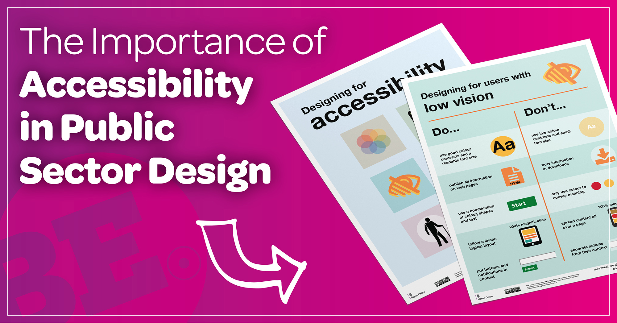
We now live in a world where we can (and increasingly do) make and create things that are accessible to as many people as possible. Anything manufactured goes through certain standards and even light switches and plug points in new build homes must be fitted at a specific height.
This is also possible, and indeed sensible, with design.
The design of websites and content can be accessible. Accessibility in design might not be on your radar right now, but in many sectors, it is now or will be soon.
Is there a legal duty to make websites accessible?
Not yet – but it’s coming…
A standard requirement for websites in the UK moves us all towards an online world that is as accessible to all as the real-life world aims to be.
“Public sector organisations have a legal duty to make websites accessible.”
For now, it’s only the public sector that is governed by law to make website more accessible, but it’s worth reading on if you’re in the private sector as it highly likely to follow eventually… and it just makes sense when you consider it all.
At least 2.2B people globally are classed as visually impaired, and there are many others who can’t read or who don’t have English as their first language. Building and designing for them isn’t just a nice to have – it’s a huge market you need to consider.
You should also pay special attention to these tips if your main audience are over 50, as they’re statistically more likely to be visually impaired.
Balancing design with accessibility
The big challenge here is getting it right for as many people as possible. And one area we’re keen to express an importance on is design (for obvious reasons!). You can have a beautiful website with great UX and make it accessible; you just need to plan it carefully.
It can be very difficult to balance these legal requirements when it comes to design and making things work, but it is possible.
Some areas to consider are:
- Choose colour hues, contrasts, font sizes, and font weights that meet AA compliance.
- Avoid using colour hues at the ends of the spectrum and instead go for a happy place between dark and light.
- Oh… and make sure background colours aren’t too faint. To be honest, avoid this anyway as even those with great eyesight will have to work harder to see it.
What about ALT Text?
ALT text (alternative text) is a small description of the image that you place in the code of your image – usually via your website’s Content Management System (CMS) – to describe the image to the visually impaired.
By using the ALT text option on your images religiously you ensure your website is now more accessible to people who have a visual impairment. In addition, good alt text also helps improve your site’s search optimisation (SEO). Here are some great tips on using ALT text to increase your SEO. Google images, for example, uses the ALT text and image title to determine where the image appears in the search results.
The limit on ALT text is around 140 characters yet needs to be detailed enough to explain all areas of the design. It’s a real artform to get it right.
Social media
Social media is another place to consider accessibility. Social posts come up as ‘decorative images’ when they contain both image and text to someone with a visual impairment. No other information can be read.
Important text needs to be on the post; not on graphics because they can’t always be successfully read by those in need of accessibility assistance.
Many scheduling tools or social media sites won’t include any prompts to add alt text either. Again, this may change soon. LinkedIn has recently started prompting for ALT text on images so be sure to use this option when you can.
Don’t hide your messages in the design
Important text needs to be on the page; not just on the graphics. Text on images can’t be successfully read by people who are visually impaired.
It’s common in web design for key messages to be in graphics or banners but unless those are places that house your heading 1 or heading 2,3,4 titles then it’s possible that you’re keeping all the best information to those with 20:20 vision and alienating a large section of your visitors.
Death of the infographic?
This is a huge issue. The popular infographic is fairly useless when you consider all the above, isn’t it?
This new design rule could have a knock-on effect on posters too. If you’re reliant on designed downloadable PDFs, slides, infographics, or similar then it’s time to have a re-think. Here at Be Smart we’re up-to-date with the latest thinking on this, so can help you to find creative alternatives. We recommend you start looking now.
This is a good thing. You’ll reach and help more people and more of us will be able to read about you. So don’t see this as a challenge – see it as an opportunity!
We work with many public sector clients and have a brilliant understanding of how you work and how design works for you and your audiences. Get in touch and let’s chat about accessibility in design – or anything else you’d like to discuss.


