

Before
After
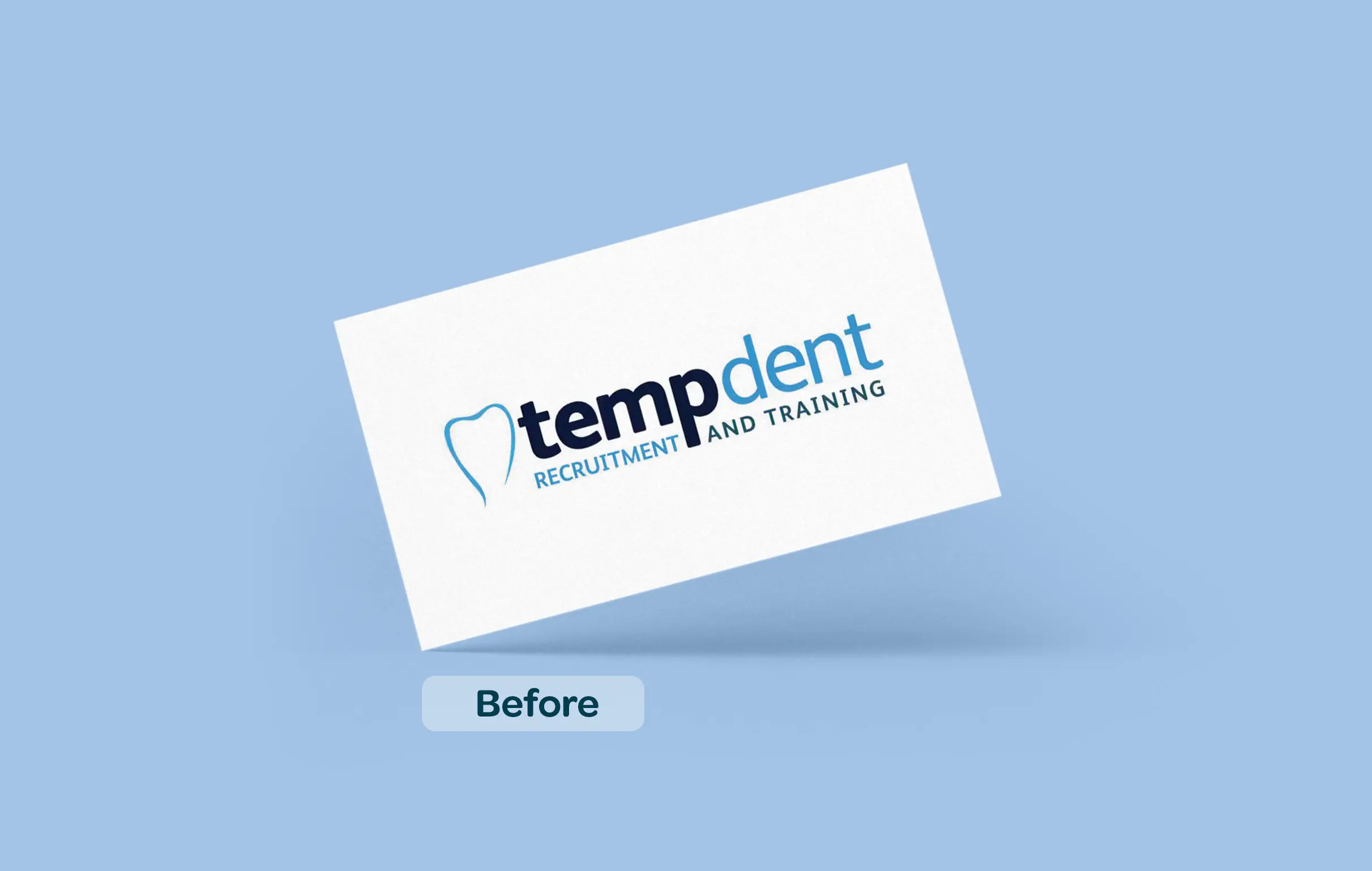
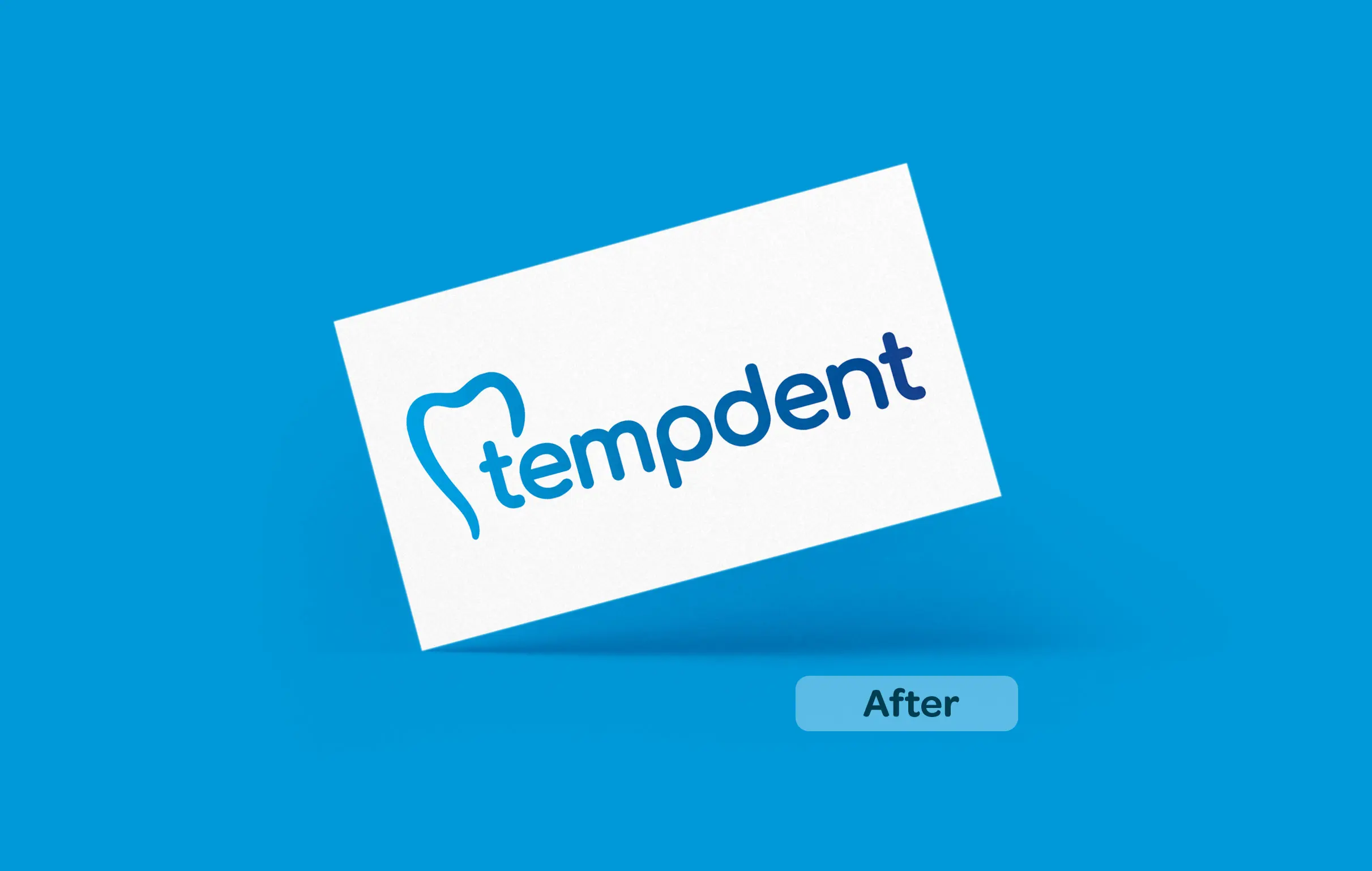
 Rosie LeaI recently had the pleasure of experiencing the Be Smart design branding my business, Rosie’s Rural Services and I must say, I was thoroughly impressed. The new brand and design elements have truly elevated the company's image and positioned them as a professional and reliable service provider in the rural sector. One of the first things that caught my eye was the new logo design. It perfectly encapsulated the essence of the company - bold, vibrant, and trustworthy. Overall, Be Smart did an excellent job with, Rosie’s Rural Services' rebrand and was a resounding success. It effectively communicated the company's values, expertise, and commitment to serving rural communities. I would highly recommend them to anyone in need of design or rebrand services, as they have truly set themselves apart with their new brand and design.
 Oliver BryanHaving used Be Smart Design for both personal and business requirements, I can say that the quality of the work and the level of service are second to none. The team created a 'brand' for our wedding stationary, with a common theme throughout. Special praise must go to Amy for her incredible artwork. Be Smart has also developed a re-brand for my business, helping us to have a more professional image to better reflect the services we offer. Would definitely recommend!
 Julie HoldenI always love working with Philippa and the team at BeSmart Design. They have a unique way of delivering a fresh perspective, regardless of the brief. Highly recommended for design work, branding, photography, print, digital comms and more.
 Livv Housing GroupLove working with Be Smart Designs, always attentive, creative and are great to work with. Their knowledge of the housing sector is second to none and would highly recommend to other providers.
 Alex Kinnear-MellorBe Smart are a proactive, supportive agency who will go the extra mile for their clients. Approachable and enjoyable to work with, they are also cost effective without scrimping on quality.
 David AndersonAs a small business starting out and establishing what our brand might look like, we could not speak more highly of BeSmart and how excellent they were in helping us realise and showcase this through our new website that they created for us. Communication was superb and so helpful, with everything being done very promptly. In addition to this they created some excellent business cards and a signature for our company email which tied everything together and made us look a much more professional outfit. Would highly recommend if anyone is considering using them!
 Natalia OtlingerŚwietna polska marka. Bardzo dobra jakość i przystępna cena.
 Staffordshire County Council“Working with BeSmart has been a delight from start to finish. One of the best creatives I’ve worked with, they combine creativity, speed and the highest levels of customer service into one. I would recommend them to anyone looking to break the mould while still basing their work in insight and strategy.’’
 Jayne Ward-LuceyI would highly recommend Philippa and her team for an addition to your marketing needs/strategy/rebranding. They are inspirational in helping you to look at your services and industry in a new light and guiding you on expanding your reach in the digital world we now live in.
Chat with one of our Branding & Digital Experts on WhatsApp