Not what you wanted? Here’s why your design work isn’t up to scratch

Getting what you want or expect from your design agency is a healthy objective. If you’ve ever commissioned some design work, perhaps for a new website, leaflet, or brochure, and felt a little disappointed, then we have some terrible news for you…

… it’s your fault.

Well, actually, it’s your design agency’s fault, but you chose them, and you gave them the information, so you have to own some of the responsibility.

Sorry.

There’s a really simple way to avoid this, but it’s not common knowledge, so we often need to explain this to clients.

Before any work can be carried out, the proper design process needs to happen.


Good grief, that’s not a brief!

It all starts with a good design brief. The design brief sets out everything: where you are now, what you want from the work, and ultimately how that looks at each stage.

The design brief is a partnership between you and your agency, and it should never be 100% from you. We’re sorry to say, but nearly all clients don’t actually know what they want. They think they do, but they soon realise they don’t.

We’re well known for pushing back when we’re given a brief. Don’t give us a brief and expect us to put it into action before we’re certain it’s actually right for you. This is probably the reason the majority of disappointment happens: the design agency just do as they’re told!

No, no, no!

We’re the experts in design, and you’re the experts in what you do. Although some direction and guidance from you is essential (and meetings will very much involve you and your ideas), you’re not the brief makers – we are.

Which is good for you, because we’ll listen rather than just sending you a bunch of paperwork to fill in.

If you’ve been disappointed in the past, it’s likely you created the brief and your design agency weren’t brave enough to push back. We’re brave because it’s for the right reasons. We get the best results when we work on a brief that will actually give your brand or project the results you want.


New branding – what to consider

When we work on a new branding project we have a more detailed branding questionnaire which we use pre-strategy session to give us background information we need before we meet up with you.

It’s completely normal to not be clear on exactly what you’re all about at this stage.

If you’re not clear on your vision, mission, values, purpose and reason for being, that’s when our branding head honcho gets down and dirty and helps you to explore it with a branding questionnaire and dig deep strategy session(s) to arrive at the answers that drive results.

We wouldn’t just accept any old brief for a new brand. It’s up to us as the branding experts to diagnose and weed out the problem to get to the ‘big idea’ that will set you apart.

You might have an idea as to what the problem is, like:

  1. Lack of growth
  2. You’ve been bought out or you’ve merged with another company
  3. Your look is dated
  4. You have trouble recruiting and retaining good staff
  5. You have negative connotations/PR with their brand

This is where our skill lies; in working with you strategically to define and craft this in words (yes, words not pictures!) before we even start the creative.

Once you have your branding in place, everything else flows.


A design briefing conversation

With a design project, we start this off with an exploration into the project with a briefing sheet. We’ll ask probing questions that give us the answers we need to create the right end product for you.

This briefing sheet will guide us down the right path and make sure that the project is geared towards your customers and end users. It’s not about your CEO and their favourite advert. (Yes, that does happen!)

Inspiration from other places is great. We love that. But a design from someone else was designed for theirend users, not yours.

We often find that the design process is approached like a new hair-do…

We’re sure you’ve been there, in the hair salon, waiting for your turn. On the table are loads of magazines showing famous people with amazing hair. These are often used for new style inspiration.

But unless you’re a model, those people are not like you. They have different heads, different hair, better styling products, and more.

Choosing a haircut from someone else and whacking it on your head is nonsense. It’s exactly the same as nicking ideas from Nike for your social enterprise ad. They’re worlds apart.

The new hairstyle (and design) should start with the end result:

What are you working with?
What’s the best look for that?
Will that style suit your customer?
Will it get across the right messages?
And will your beliefs and values match that new do?

You have to design from the ground up. Not doing so is where some big mistakes and poor results can creep in.


The briefing sheet – the design sat nav

Not arrived at your desired destination? Maybe you put in the wrong coordinates! Asking the right questions at the very beginning will give us the best understanding of what you want and why you want it.

Each project is different, but we find that these questions help every situation.

This is what we ask our new clients, and it drives the project forward as a key part of its success.

Let’s take a brief look to give you a better idea of how the briefing stage should work.

What do you do?: This might sound obvious, but your branding agency need to clearly understand what you do. Why are you here? Who do you help? What is it that you provide? What difference do you make?

Your purpose: Well? What is your purpose? This can be your “Why” or your beliefs and values. These are core parts of any brand that you create. Without this, your brief is soulless!

Your mission: On a mission? Tell us. We need to know if you’re going to change the way people look at concrete or tell them that white is the new black. Whatever your mission is, you need this to come through in your brand and all the marketing you do.

USP:We’re not one for clichés, but your USP (unique selling point) is important. These simple three letters can really get clients thinking about themselves. This is especially important if they’ve never created their USPs.

Competitors:Who are you up against? This isn’t so we can copy them. On the contrary, this is so we absolutely don’t copy them. We want your brand, design, or whatever your brief is for to be 100% unique. Otherwise, you’re going to go through all this to simply blend in or confuse your audience.

Your message: What message are you trying to get across? We’ll work this into everything you’ve supplied so far and make it resonate in the right way with your ideal client or customer.

Values:Your values are important. What do you and your brand stand for? The last thing you need are words, phrases, designs, and images that aren’t authentic. Your values can often help to stop these from entering the project.

Brief description of the project: Thisisn’t just what you’d like us to create but also what else is happening around it. If there are real-world events or online parts to this, we need to know so that we can create a brand and design that fit it all.

The objective of the project:What are you trying to do here? What’s the end goal? Tell us (or your design agency) and you’re more likely to get it!

Target audience:Who are we aiming this at? This information will help us to find them, research them, understand them, and create a brief and then a design to suit them.

Limitations and considerations: What can’t we do? If there are terms, situations, brand limitations, politics, or other reasons to avoid certain things, tell us now.

Essentials:What mustbe in your project? Getting these details in place at an early stage ensures there are no “Didn’t you include X?” questions during the final brand reveal!

Budget:How much have you put aside for the project? Obviously, you can’t have the world on a local budget. Knowing this will help you to set the expectations for the project and even give you the rationale to get more budget!

Timing:When do you need all this in place? Well, this one’s simple. Every project needs a deadline to work to, to keep everything on track.


And now you’re ready to get what you want

If you’re not giving your design agency the right information, then don’t expect the best results. A good brief – one created by you TOGETHER with the brand and design agency and one based on all the right information – is what you need.

We’re brief makers, not brief takers (more on that here) because we know we’re good at what we do, and you’re not a designer!

It makes no sense to give your agency the brief and get them to do it. And it makes no sense to get started on a project without first building a watertight brief and roadmap. And of course the brand creation comes before any design work.


Had poor results in the past? Want to avoid the same thing happening in the future?

Be smart and contact us now. We’ll grab a cuppa and chat about your plans.

Copyright in design: How to own it and never get caught out

Copyright protects graphics and design. Copyright, patents, designs and trademarks are all types of intellectual property protection. Designers get some types of protection automatically, you’ll have to apply for your copyright after you get your content from your designer, or arrange it prior to work being carried out.

It’s pretty obvious that you can’t go around stealing someone’s logo, and your designer should know this. You’d not only look a little silly, and you’d deserve a threatening letter on your doorstep!

But, this goes far deeper than using some one’s jpeg…

Copyright runs deep in many areas of design and you might not have ever thought about how that transcends into images, style, and where you place them.

If you’re working with a branding agency like us, then here are some areas of copyright in design for you to consider.


The copyright is all ours… we created it

Here’s the big one that many are surprised to hear.

If you commission us to create a design, brand, logo, or similar then the copyright is ours. It’s ours until you pay us and it’s ours afterwards too. We’re the creators and the copyright is automatically given to us.

It’s pretty much unknown, but unless you ask for the copyright, the design copyright will stay with the agency who created it, as that’s who the law states owns it – unless it’s passed over in a legal agreement.

The important thing to remember therefore is to get the copyright when you have anything designed so that you’re future proofed. Ensure that you have full ownership over your design so you don’t find yourself in trouble with your own collateral or brand.


The design itself can be protected; the rest can’t


The actual design can be protected and the way the design is set, the unique logo or graphics, and the images you use can be protected as a final entity. But you can’t protect it all.

There was an interesting case recently where a baby product was (allegedly) copied by supermarket chain, Aldi. In any case, the design was rather similar. The pushchair cover that helps to keep the baby cool in the heat, Snoozeshade is a simple design and uses a material that covers the pram or pushchair and stops the heat getting in.

The Aldi alternative is very similar and the supermarket marketing even uses a lot of the wording from the original site. It’s unclear as we write this what the outcome of this scenario will be, but it shows you that big brands can and do copy – or at least ‘get inspired by’ other products and that you can’t protect against it all.

Plagiarising text and content is one thing, but using elements of a design, including materials, can’t be protected as much as one might think.

This follows through with other areas of design too. You can protect the final product, and we suspect this will be the argument against Aldi, but you can’t protect the elements such as colour, style, or story that make up the design.

That said, when you go up against Sainsbury’s like Jel Singh Nagra did, you’re best to back down and remove your Singhsbury’s sign when they threaten legal action against logo infringement as they have most likely protected it beyond most!


If your design or images are used, you have rights you can push for

Just like Sainsbury’s and other brands who’ve fought for the removal of images or branding that infringed on their copyright, you can protect your brand.

Most large companies will cooperate and try to come to an agreement…  it’s simply not worth the bad PR and they have the money and resources to re-design products and re-work their marketing.

If you’ve taken images or commissioned someone to, and you own the copyright then you have a very good case against anyone who uses them. For the most part you’ll find it an easy conversation with a larger company as they know all too well the rules of the game.

It’s always best to check who owns the copyright before you publish, though, so that you’re covered in the future.

In the US they’re less protected than us, and this article about fashion companies copying smaller businesses’ designs makes for interesting reading.


Be careful of other’s copyright


Moving on from being copied yourself, make sure that you or your designer source content for your designs that are eligible for use. Right-clicking on Google images isn’t the best approach and even on your company blog you’ll be seen to breach copyright.

An approach like this might result in you getting an email like many did from Shutterstock after the digital image site they used digital tracking software to find all the images that were used without being purchased (cross-referencing the meta data in the images). They issued fines to the website owners.

If you or your designer is going to use images, graphics, or photography then make sure you know who owns the copyright.

In an interesting case in the past few years, it turns out that selfies taken by a celeb’s Crested Macaque Monkey, using equipment belonging to the British nature photographer David Slater, was first seen as the right of the monkey, not the photographer.

In a cruel twist of fate, the photographer lost the rights to the photos as he didn’t ‘create’ them, and they were deemed the right of the monkey. This was until in 2018 the courts stated that an animal can’t own the copyright for anything as it’s not human and the images remain copyright free and are freely used (as well as by the photographer himself) across the web.

But most images are not taken by a monkey, and will be the property of someone human, so make sure that you buy your images and graphics and save a copy of the contract and Ts and Cs so that you can prove you have the right to use them as deemed by the creator.


Commission it and then ask for copyright


The main takeaway here is that, unless you ask for it, you don’t own the copyright and you should if you’re going to use it in your marketing and branding. It’s unlikely that a designer like us will ever try to be awkward about it and you should be given copyright right away. That said, it’s not always standard practice and if nothing is done, you don’t own the right to designs created for you.

If you need help, advice, or of course new designs then please do contact us.

We create from credible sources, we use elements that are acquired correctly and then of course we create brand, graphics, images, and photography ourselves so our work is as unique as a Macaque selfie.

For unique branding and design that you own, BeSmart and drop us an email today.


We’re a naughty brand design Agency – we often don’t do as we’re told!

We’re sure you must have heard the old adage, ‘The customer is always right’.

Classic.

Classic ERROR!

The client isn’t always right. The client doesn’t always know best. And sometimes, just occasionally, it’s best to be honest and tell them.

We do.

We’re often seen as a naughty agency, as we don’t do as we’re told.

We don’t do it to annoy our clients though. We do it because we know we’re right and they’re wrong.

We do it out of love!

Love for them and love for the end results.

Harsh? Maybe. Results-driven? Abso-bloody-lutely!

There are many great quotes in the business world, but we feel this one sums up our point perfectly. It’s from someone who knows a thing or two about making businesses successful. You may have heard of him.

“It doesn’t make sense to hire smart people and tell them what to do; we hire smart people so they can tell us what to do.”
Steve Jobs, Apple inc.

That’s why we believe that if you ask us to work on your brand and design, then you’re advised to let us ‘do our thing’ over expecting us to follow your ideas. We’ll certainly listen. But if you’re off the mark, we’ll tell you, explain why, and do what we feel is right.

Clients don’t always know best; we do

We’ve been doing this thing for 25 years. With that comes a lot of experience, including experience we gained during times when things didn’t turn out the way they were expected to.

Why would all that experience be ignored (by us) when a client shares a brief that we know simply won’t work?

There have been many times when a client briefs us on a job and we just know that what they want us to do, or the way they want us to do it, just won’t work.

It won’t get the results they need. That’s what they’re paying us for. So we push back and say (politely) “No”.

We say no to clients for a few different reasons

Here are some of the main ones.

#NaughtyAgency


The comms or marketing person is inexperienced at briefing agencies

We’re not trying to be all high and mighty here, but there are good and bad ways to brief a design agency. If you’re not experienced in the best way to brief an agency on a project, then the results you get may well fall short of the results you want.

We feel it’s a good thing to push back and ask lots of questions. It helps the person briefing us to improve and also helps them to get a good result for their team. It helps them to think of things they may not have even been aware of. That can only help everyone in the long run.


The client wants to achieve gold star results on a lead level budget

Setting expectations is key to a good working relationship and when the client has a grand plan presented on a Fisher Price budget we have to say something! It’s not their fault, they’re not trying to pull the wool over our eyes, they just have a lot of optimism!

It’s only right that we tell them like it is. For this, you get that, not that.


The briefing has come down from exec level, so it needs to happen

Oh dear. We see this one a lot. Just because someone at the top had an idea in a meeting does not mean it will work in a design brief and it doesn’t mean it’ll work in the real world either.

We’re often met with a marketing person who’s just going with it as it’s come from ‘up above’, so they don’t question it.

We do, and we counter pitch with a new brief instead. But we’ll explain and help them – we’d never leave them stuck.


The client wants an 8 page brochure and has enough text for a 16 pager!

It can be really easy to create a lot of wording and not focus on how that will look in a beautifully designed brochure. We’ve seen 16 pages of copy crammed into an 8 pager – it’s ugly! Don’t ruin the design just because you think you want an 8 page brochure.

We’ll advise you to expand your brochure or shrink your copy depending on the best option for you and what would work better for your customers.


The client wants an infographic but have no facts or figures

We’re good, but we’re not that good! We can create the most amazing design, but we need something to go on. Infographics work very well indeed… but you need to supply the content or it’s not going anywhere!

We design it, you research it. We’re not about to pretend we’re an expert in your world any more than accept you’re an expert in ours.


The client wants Word templates, but we say no because they’re better in PowerPoint

There are so many different ways to present your message that we’re going to get suggestions that won’t work out. PowerPoint, for example, is far easier to work with for less-experienced people than Word and the final piece will be easier to present too.

If you want it in Word, but it’s better in PowerPoint, you’ll be getting it in PowerPoint. #SorryNotSorry. 😉


The client wants an app because it’s the ‘trendy’ thing to do

We love a good app as much as the next agency, but sometimes you simply don’t need one. When it’s a sledgehammer to crack a nut, we’ll hit you with some home truths as well as saving you some money and effort.

If all you need is some extra functionality on a website, we’ll do that instead as it’s less expensive and might be a better solution to your problem.


The client wants to use crap images from their iPhone

Smartphone cameras have come a long way since the introduction of the first camera phone in 2000, but even now with the 12MP iPhones, the quality won’t be as good as what the good old-fashioned camera was designed for… taking photos!

Tell us you want to use your smartphone photos and we’ll suggest using some decent stock images or having some bespoke photography instead.


The client asks us to deliver at break-neck speed

Whilst we always will try our hardest to get the design project delivered in good time, in our experience, it often breaks processes when we ‘rush it through’.

Ask us to go to faster and we’ll be straight-up and tell you that it isn’t possible, rather than over-promise and under-deliver like some people do.


The client wants to rebrand but won’t spend on the guidelines

Cutting corners on a re-brand isn’t a great idea. Your brand will form most of your marketing in the future. Brand guidelines are sooooo important and not having them is like flying in the dark!

We don’t like flying in the dark or asking you to, so we politely insist that you have guidelines with any re-brand to ensure our new creation continues to work for you in the future.


The client has to produce an annual report and doesn’t want to ‘design it’

Hang on, you do actually want this report to be read, don’t you? The whole idea is that your audience actually get the information you’ve put together, yes?

By designing it with a theme it makes the most of it and encourage people to actually read it. This is a small investment in comparison to the overall cost of the project.

Ask us to set it in a Word document and we’ll be having words!

We’re not awkward. We’re experienced!

We’ve seen a lot of design work in our 26 years and that gives us a unique view on the way information and brands are presented. If you think your idea is great, but we’re certain it’ll fail, we’re not going to do you a disservice and go along with it.

We’re not being awkward, we’re being valuable. You’re not just buying our services; you’re buying our experience.

So there you have it. Our admission that we don’t always do what we’re told all the time!

Why great photography is essential to your brand (and when stock photos simply kill it!)

You did it! You got a great new brand created, updated your marketing and website, and launched it into the world.

You’re getting great comments and feedback and it all looks like you’ve totally nailed it. Now you have to keep up the good work and keep that brand in that great place.

… but this is where most businesses screw it up!

We’ve never been ones to hold back on what we see and we’re not about to do that in this blog, so if you’re of a nervous disposition when you’re told some home truths about branding use then click away now.

Still here? Great… Let’s get this message well and truly out there so you don’t make some serious mistakes.


Good imagery reflects on a brand and so does crap imagery


Let’s get the obvious, “No shit, Sherlock” moment out of the way and make it really obvious what we’re talking about here.

  • Great imagery, great messages.
  • Crap images, crap messages.

The quality of photos used on websites and marketing collateral is getting very messy, poor, and so off-brand! If you’re thinking about stealing from Google images or buying cheap stock from some poor online store, or even using your poor-quality smartphone snaps – just don’t!

Your photos – and the quality of them – reflect directly on a brand and business. The brand and your story are the DNA of your marketing. It’s for this reason that you need to make sure you’re using appropriate images and images that are of a quality that you would want to be associated with your brand.

A brand needs to come alive through the imagery; not be killed by it.


How to kill a brand with smiley-faced white-teeth hand-shaky people…


You know all that work you did when you created the brand identity?

You know all those meetings, emails, calls, and big decisions you made when you created that new logo, the colour palette, fonts, values, and the tone of voice?

You can kill the impact of that by heading to one of those cheap stock photo sites, downloading a file of someone you’ve never met, who’s ‘super-excited’ to be doing something very mundane (or working in a space that clearly has never been worked in before), or working on a computer with a screengrab that bears zero resemblance to you, your message, or your brand!

Here’s what we mean. Have you seen how happy these ladies are to be eating a salad? Fake news!


Does your photo represent your brand?


No? Then why use it?

That wonderful brand you created and painstakingly worked on could be let down by imagery that doesn’t fit your brand identity. It really can make or break your brand.

You can really confuse people by saying one thing and doing something else. People need to trust you to buy from you, and this is all part of building the trust.

Photos and imagery are part of a brand.

(We’ll say that again in caps as it’s important and we want to shout about it!)

“PHOTOS AND IMAGERY ARE PART OF A BRAND!”

When you had the brand guidelines created, that was meant to cover everything you do with that brand and that obviously meant website, email, social media and traditional marketing materials.

But it also meant the way you present pitches, the way you behave at business events, the way you answer the phone, the car you drive…

… and the images you use.

Put it like this:

You wouldn’t exhibit at a business show with dirty crumpled clothes, wearing your slippers, with a broken banner and some crumpled leaflets would you? And we’re pretty sure you’d clean your teeth and brush your hair before going to a client meeting.

So, you’re not going to use poor images, are you?


We believe that image styles should be in brand guidelines


Create parameters around the photos and other images that you use with the brand and stick to them.

Make sure they are aligned to the brand identity.

This plays out across all the marketing your brand will do. When you consider how many channels and how many ways you can market now, that’s a lot of areas where photos could kill the brand!

Here’s some areas to think about with your brand guidelines for images:

  • How do you find and store images for your website (for current and future pages and articles)?
  • When you create images for social media, what style do they need to be in?
  • When exhibiting, networking, or creating an online profile, what images do you need?
  • When creating a new product or service suite, how will the images be selected?

Look, here’s the deal:

If your style is active and supportive, you wouldn’t use an image of a person stood still on their own, would you?

Think about that core message you have in the brand and then ask yourself each time you use an image or photo:

“Does this convey the message I’m trying to get people to remember and resonate with?”


Stock images can look false and are often out of kilter with your brand identity

Stock photos weren’t created for you.

Images that are created for you and are very much in line with your brand work 100% better.

Stock images were created for some generic situation like “Meeting” or “Walking” or “Greeting” or even “Women running in pencil skirt to a meeting”. They’re mostly just terrible and clichéd.


[Disclaimer]

Some stock image sites are now far better than they used to be. There are some great stock photo and image sites out there and you can use them – we’ll allow you! But you can only use them on one condition:

Make sure you choose images that match your brand identity.

We understand that sometimes the budget won’t allow you to have the best images or photos and you may well have to go for stock, but when you do, select stock images VERY CAREFULLY.


By the time you’ve spent hours looking for the right stock images, you may as well have paid a professional to get exactly what you want…


We’ve started offering this very service because we want to put a stop to the death of brand through poor images and photos.

Photos taken for a specific piece of content or brand identity are far more powerful and often a far more effective choice (for brand, time, and money).

Yes, you can find a stock site that suits a brand and we’re sure you might be pretty nifty with an iPhone, but you can’t beat unique and on-brand images taken with the brand in mind.

Wouldn’t it be easier to have your own bank of images of everything you need, so you can just choose from a selection you know are high quality and relevant?

</Rant over>

… well almost.

Go back to the website, social media, marketing, and wherever else you have images and then get your brand identity and guidelines to hand and be honest with yourself:

  • Do they represent it?
  • Do they amplify it?
  • Or do they kill it a little bit inside?

Choose wisely or create images for the job in hand.

The results are powerful, and you’ll have a far stronger message.


Here’s Why We’re Brief Makers, not Brief Takers

Getting a brief for any work is essential before we begin our design projects.

Knowing what you as a client want and needs is key to a successful project.

A brief for your design is a core part of the process… but there’s a problem we wanted to share with you.

  • What if the brief isn’t what you really need?
  • What if the brief is misguided or badly thought through?
  • What if… the person who created the brief isn’t actually the right person to do it?

This transcends all types of work and it’s not just limited to design. The key issue here is that the brief traditionally comes from you as the client; the person who needs the help to create it.

But you’re not the person who knows how to create it.

That’s why we’re brief MAKERS, not brief TAKERS.


Many design agencies are brief takers

Getting asked to do new work is exciting. Without that enquiry, call, meeting, or interesting email, our businesses wouldn’t flourish, and we’d all be in a painful place.

Getting the chance to work on a brief is a great feeling. We feel that many agencies simply let that excitement take over and they forget why they do what they do in the first place.

A brief doesn’t need to be set in stone, and it shouldn’t be taken as the only way. A brief is merely a set of instructions from a client.

If a designer follows a brief from a client to the letter – with the greatest respect – it’s unlikely to be a success. Our clients aren’t the best people to create it – we are.

The major problem (and we see and hear about it a lot) is that agencies are simply too lazy/afraid/inexperienced to question the brief.

We know, we understand, and we get it. Obviously we don’t want to lose your contract! But we understand that we won’t keep you forever if we let you guide the work and the outcome is inferior. We think we’re better placed to create the brief, or at least amend it slightly if need be.

Other agencies might use brief takers, who simply take instructions from the client and go away and create something according to what the client thinks they want, without question… and we wanted to tell you that that’s not how it should work!


Are they really solving the problem?

Any work we take on for a client (especially design and marketing) needs to fix a problem. Before we go any further, and way before we start work, we need to work out what that problem is.

This takes a good conversation, or workshop, or a session with the team or the core part of the business to do this.

We ask you: “What are you actually trying to do?”

Because the brief you created is what you want to do, not always what you need to do!

Asking the right questions, poking in the right places, and posing some awkward suggestions is where a real design brief comes from, not from a brief created on the basis that you think you should do something because “it looks good” or it’s like someone else’s or “similar to the competition”.

MISTAKE!

Your project is built on sand!

Ultimately, especially with what we do, the end result is highly dependent on the build or final format, and that’s dependent on creating the right thing on the right basis in the first place!

EXAMPLE:Let’s say that company A has a problem with their image.

They want to attract young millennials, but their messages, brand, and subsequent marketing falls on deaf ears with them as it simply doesn’t resonate.

Let’s say for a moment that company A’s directors and core team think it’s something else. They think they need a logo refresh and some brighter colours and maybe some kind of social media style graphics to add to their new comms plan.

If we went down the road of the brief, it might get close, but it wouldn’t hit home as well as it could have done, had we really dug down to the real problem.

In effect, the final project is built on sand!

Without a ‘dig deep’ conversation there is no real foundation to the project and therefore no one achieves the results they want (or expect).

It’s amazing how often this can come as a shock!

“Why didn’t it work?”

… because you solved the wrong problem – one your customers didn’t have!


You’re solving a problem, not creating another one

Design is there to create a solution to a problem and when we dig deep and ask the right questions, that’s when the magic flows.

The magic flows because we become entwined with you as a client, understanding your business, your challenges, your flaws, and your shiny good bits. We create that extra special relationship so we can reach in and tease out the answers to the problem in order to create results.

What we don’t want you to do is ‘wing it’ or allow yourself to be led down the wrong path by someone who means well but doesn’t fully understand what you’re trying to achieve with the project.

Don’t take the brief – MAKE the brief!


We’re right nosy, we are!

With 25+ years’ experience, Philippa, our MD is a nosy git!

She’ll ask the questions that people don’t think or dare to ask, and she does that because we want to give the best service and get the best results, and she knows that needs the right questions and the subsequent answers.

“Isn’t it a risk?”

Well, it all depends on the way you look at it.

  • We take on the brief and do what you ask, we’ll keep you happy.
    But that’s only a short term
  • If the design work doesn’t convert, it’s actually a LOSE.
  • But if we make the brief and challenge what you ask and get a great result?
    That’s a long term WIN for both!


It’s all about the long game and the end result

You need to get the results to ensure getting more business, and that requires you to start from the right place and not build your entire project on sand.

Be brave… your project will be all the better for it!

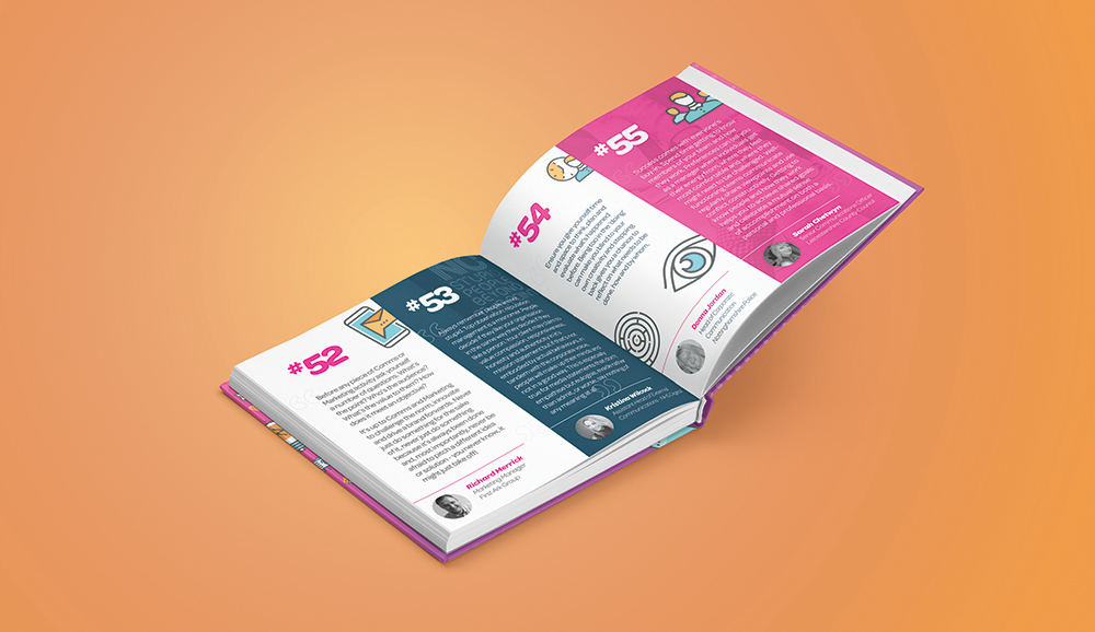
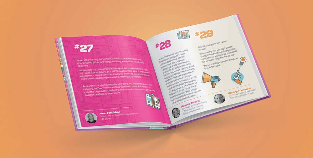
Announcing Comms Tips from the Experts…coming soon!


In July and August 2018, we contacted senior comms experts across both the public and private sectors in the UK asking them:

‘What’s your top success tip, pet hate and how you overcame it or advice you could share to fellow comms people?’

Quite a few eager people dived in feet first to share their pearls of wisdom.

We’ll be launching this in the form of an ebook very shortly and hope you’ll find it useful – perhaps when you’re in need of some ‘oomph’ you can dip in to it and get the inspiration you need. Or better still flick randomly through the pages until a page grabs your eye and take it that your meant to read it at that moment? Every penny we raise by selling this ebook will go to charity. Funds raised from the sale of this ebook, will be split evenly between PETA UK and Cancer Research.

We’d like to give a big thank you to all the contributors, without you this wouldn’t have been possible!

If you’d like a copy watch out for the launch coming soon…

Are you feeling the pain of Word?

Are you feeling the pain of using Word to create your newsletters or editable documents?

We often get asked to design newsletter templates in Word… and we don’t recommend that as an option. Not unless you want to create chaos in your marketing/comms team!

The functionality of Word for the average user is a nightmare; it takes longer to sort out the formatting than populating it in the first place. We often recommend we design it using InDesign then build it in PowerPoint as it gives you much more control and less hassle when you come to populate it. Boom.

If you’re feeling the pain of Word, give us a call on 01902 797970 or email us. Let us work with you to create a good looking newsletter template or other editable documents in Powerpoint.

What makes great design?

I’m often confronted by design that a business has had created and they ask my opinion. Quite often it leaves me with a sinking feeling, not that I’m decrying other designers’ work but I feel I must help educate design buyers to understand what makes great design.

Design is about creating harmony and balance among the elements and having them come together in a final product that is outstanding. It’s not simply a case of throwing some images and copy on an advert or brochure. It’s so much more than that.

The designer/client relationship is a partnership and often this is not the case. By taking the time to choose the right agency and getting to know how each other work, you get so much more out of the relationship. Being thorough with your briefing and the agency being thorough in their questioning and research, the magic happens.

I want to help design buyers really understand what makes great design. It’s not a guide to help you to design yourself but how to get the best results from hiring a design agency to create the project for you. After all that is what they do, day in day out, for a wide variety of clients. It’s a guide to help you assess the design concept that is presented to you.


1. Do the ground work

You wouldn’t build a house without creating the foundations first; if you did it would fall down! The same goes for any of your marketing – think it through. What do you stand for? How do you do it differently than anyone else? Who is your ideal client, what is your message and then finally what channels will you use?


2. Stand out

In today’s message-heavy world it’s an absolute must to stand out or you’re wasting your money. By that I mean standing out with a great offer or proposition. Be different. Don’t just create something that everyone else is doing because you won’t stand out.


3. Work out your hierarchy of message

Your logo isn’t the message, so don’t have it at the top of the marketing piece as the main feature. The main feature should be the message/benefit you want to convey – the point you want to put across.


4. Appropriate typography?

Keep to a maximum of three typefaces and choose the typefaces to suit the message and the audience. For example, where you’re creating a message for your tenants to move them from traditional contact points to digital, choose a typeface that is friendly and non-threatening.


5. Lines and shapes

Lines are effectively used in separating or creating a space between other elements or to provide a central focus. The direction, weight, and character of the line can convey different states of emotions and can evoke various reactions.

Use shapes to add interest to your elements. Angular shapes indicate masculinity while velvety and curvy shapes like circles indicate femininity. Square shapes, elements, or designed items communicate security, trustworthiness, and stability. On the other hand, circles are like eye candy: They are organic, complete and communicate wholeness.


6. Alignment

When elements are aligned, they create a visual connection with each other that communicates a story. Alignment helps to put elements together in a visible and readable arrangement.


7. Choose the right imagery

Put the cook in the kitchen, so if your ideal client is an elderly person, don’t use images of a young person. Even more to the point try and avoid stock imagery – invest in good quality bespoke photography – besides probably seeing your image elsewhere, you really can tell it’s stock imagery!


8. Sets you apart in the mind of the audience

There are many companies in your field doing what you do – unless you’ve invented a time machine. The key is, does your design set you apart? Does it position you as credible and align with your values?


9. Adaptable

Often at the outset of your project and the briefing stage, the agency should be asking you how this project will be used. Will it need to be used elsewhere and will it work on social media for example? We recently designed an annual report which included a set of infographics that were to be used on social media so it was important to ensure they were easy to dissect and supply as individual images.


10. Instantly understandable

There’s no point making it difficult for your customer to understand what you are trying to say – make it easy for them. If they have to think too hard about it they will quickly move on.


11. Simple

‘Less is more’ and the most effective design pieces are those that are simple and uncomplicated. For example if you need a roller banner for an exhibition don’t try and put enough text for a brochure on it because people won’t read it. The roller banner is designed to give a snapshot of your business because it’s viewed from a distance.


Space is powerful when you want to deliver a direct message without the clutter of other design elements.


12. Contrast

You want your message to be conveyed to as many people as possible. Think about contrast of colours. Don’t for example allow yellow type on a red background as it will ‘jump’ and many people won’t even be able to read it, particularly those with visual impairment or the over 50s. Think about the contrast of certain colours and make your design piece as accessible to as many people as possible.

Contrast is also used to make elements stand out and grab attention. It creates a focal point in a design, creates visual excitement and increases the interest of any design creation. It can, for example, redirect the attention of a reader to a more important part or message of a presentation.


13. Colour

Colour affects the mood of the design. It represents different emotions and different personalities. The use of the colour red can incite anger, love, and passion or strong will. On the other hand, the colour blue, creates a sense of peace, serenity, and security.

Colour puts emphasis on the pertinent information that is conveyed by the other visual elements. It’s well worth checking out the psychology of colour that can easily be searched for on the internet.


14. Walk in their shoes

Imagine viewing the design concept from your ideal client’s point of view; look at it standing in their shoes – does it grab your attention? Does it provoke an action in you in some way?


15. Achieving the brief

Refer back to your agreed brief with the agency – does it work? Does it convey want you want it to convey?


Beware:

  • Don’t use Comic Sans or Brushscript – it’s so last century
  • Don’t use drop shadows – it’s so last century
  • Do I even need to mention clip art?

Does your design agency charge you author’s corrections?

Does your design agency charge you author’s corrections AKA author’s amends, client revisions or just client changes? What are your thoughts on it?


It can be a difficult conversation to have with clients but we’re as clear as possible at the start that the price we quote is subject to author’s corrections. We do this because we aren’t mind readers (how lovely that would be!) and can only quote on the information we have at the time.

In case you’re not sure what author’s corrections are, they are additional client changes that add extra time to a previously quoted project that we need to charge extra for at an hourly rate.

Having said that, we make allowances for small amends like image swaps and word changes but when it comes to project brief changes, pages being added or new copy having to be flowed in, that’s when we sweetly draw a line in the sand and shout up. We’ll always be as fair as possible, utilising any unused time first.

That’s why it’s difficult when we are asked to quote for ‘3 rounds of amends’. It’s like asking ‘how long’s a piece of string?’ Unless we have the amends at the time of quoting (unlikely) it’s nigh on impossible to correctly quote for 3 rounds of amends without either quoting too much so we lose the project or underquoting it and we’re out of pocket.

The answer? Give your design agency are very clear brief and approve your copy internally before giving it to us – that way you will save yourself money. We totally accept that once you see your copy in-situ, changes will be made but they’re not the massive budget-busting kind of changes that create tensions in relationships and end up in tears.

The relationship with your design agency is a two-way street and by working with them to understand their charging structure it will make for a much smoother and happier process all round.

I’d love to know what your experiences are, please let me know hello@besmartdesign.co.uk

Essential SEO Quick Check List

printed newsletters in the west midlands

This is an article from our most recent newsletter.

Print this off, grab yourself a coffee and get all of these done at the weekend. Easy peasy, you can start ranking next week!

Page Titles:

Make sure your page titles are unique, don’t repeat words and are relevant to your business.

Bad titles:
Roof tiles, floor tiles, wall tiles
Tiles, ceramic tiles, square tiles, red tiles, blue tiles, plastic tiles, wall treatments, concrete render, wall render.

Google titles:
Wall, floor and roof tiles
Specialist car valeting in Birmingham

Tips:
Don’t put your company name on the end of every URL unless you separate it from the rest of the text with some kind of delimiter.

This is bad: Wall, floor and roof tiles Shiny Tile Company Ltd

This is good: Wall, floor and roof tiles : Shiny Tile Company Ltd

Although really, there’s no need to have your company name at the end anyway, and certainly never put it at the beginning.

Meta Descriptions
Meta descriptions have no effect on ranking, but they are displayed in search results, so go through each page and make sure the descriptions are consise and enticing. They should be like an ‘elevator pitch’ and explain what the page is about in two short sentences.

Meta Keywords
If your page has lots of meta keywords stuffed in there, get rid of them. If you do want keywords in your page, then only have a maximum of maybe fifteen, but seriously, don’t bother with them. If in doubt, take them out, they’re not used for ranking at all.

Pretty URLs
If your page web addresses look like this: www.mywebsite.com/index.php?id=5 Then you need to take action. They should look like this: www.mywebsite.com/about-us or www.mywebsite.com/shop/cameras/nikon. The URL should describe the page you’re on because it aids with navigation and is also a big help to Google.

Sitemaps
Sitemaps are like the index to your website, they tell people and search engines where every single page is. Get your XML sitemap done and submit it to Google Search Console. Then, get an HTML sitemap generated. The HTML one is actually preferred by Google, so do that one first. Get one created here: https://www.xml-sitemaps.com

Image descriptions and ‘alt’ text
Make sure the ‘alt’ tag of your images is descriptive and only two or three words long. DO NOT stuff a ton of keywords in there expecting to rank, you won’t. In fact, you’re more likely to end up being knocked out of the search results completely.

Let us know how you get on, all of these tips are pretty easy to implement but if you need any help, give us a call on 01902 797970.